
Updating a brand loved by millions worldwide
49’s is an lottery game played and loved by millions of people everyday around the globe for the past 25 years. In this time though, the brand look, feel and personality hasn’t been touched. Not only were people were seeing the same brand that left the design agency back in 1996, there was no consensus of tone of voice, brand personality and how to achieve a consistency with communications.
Our objective was to bring the look and feel into the 21st century! In a useable clear way with easy to follow guidelines that drive a consistency of brand outputs. To let people see more of the brand personality, the fun, the excitement, the accessibility, the stature – all in a contemporary way, putting distance between 49’s and the tacky end of the gaming market.

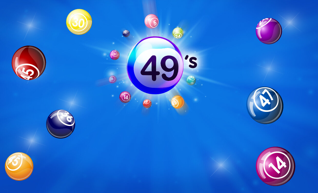
Before
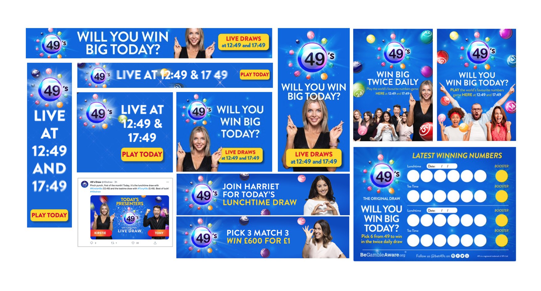
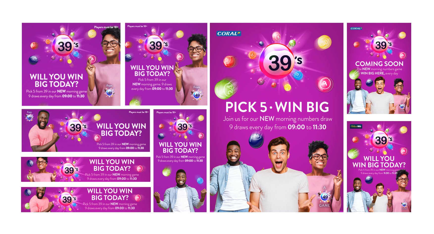
After
Our approach. The simple answer is collaborating with the clients across a series of structured meetings, with a range of provocations and stimulus. Together we defined what “business” 49’s are in, who the audience is, what 49’s actually give them and the outcome of that. We defined the personality, the tone and then brought this to life in design.
The outputs. An updated master logo, new sub brand logos, an articulation of the brand personality and tone of voice, example communications, social templates, all together in a set of brand guidelines.
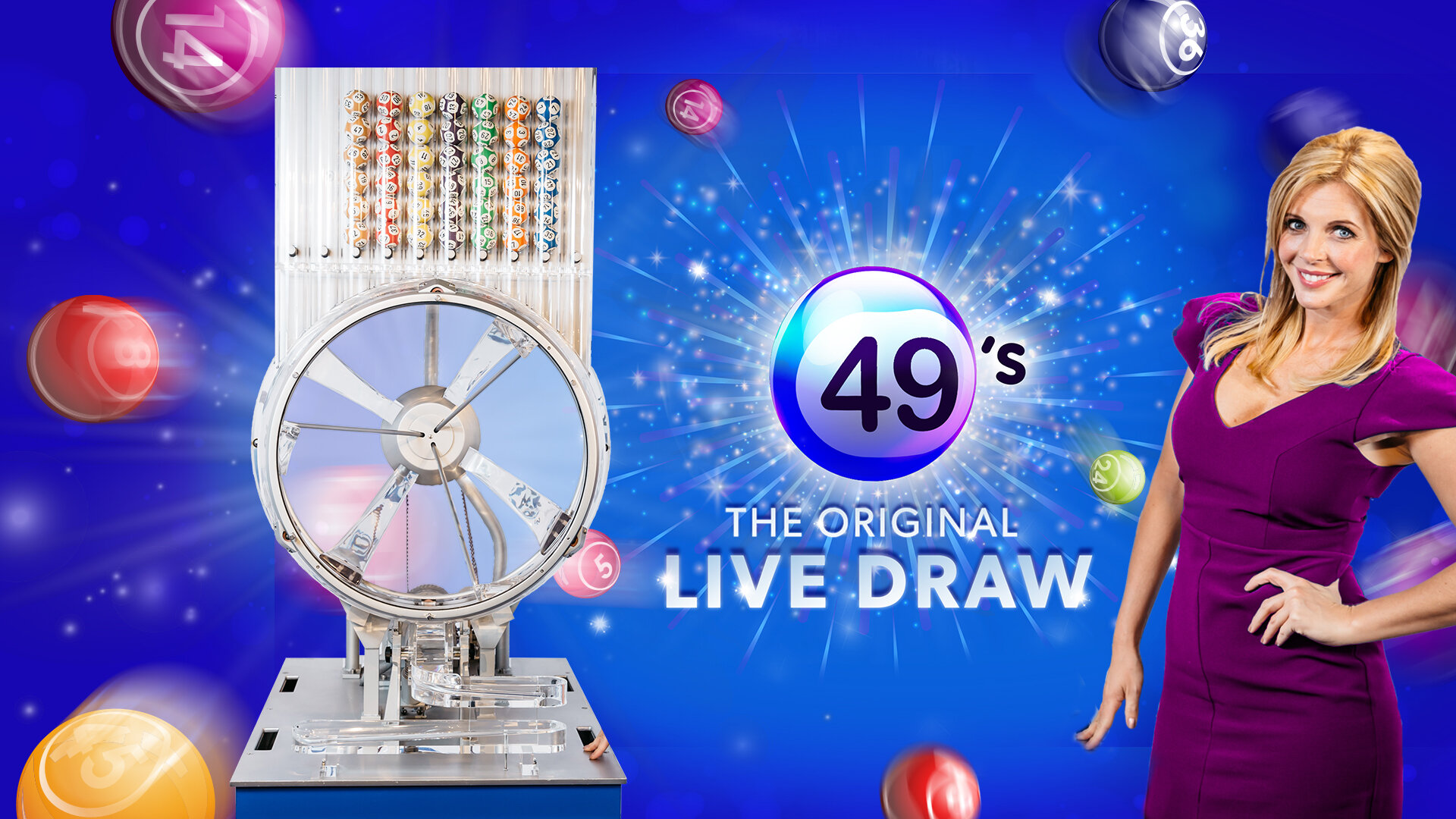
TV graphics and animation


Promotional retail poster


Promotional retail poster
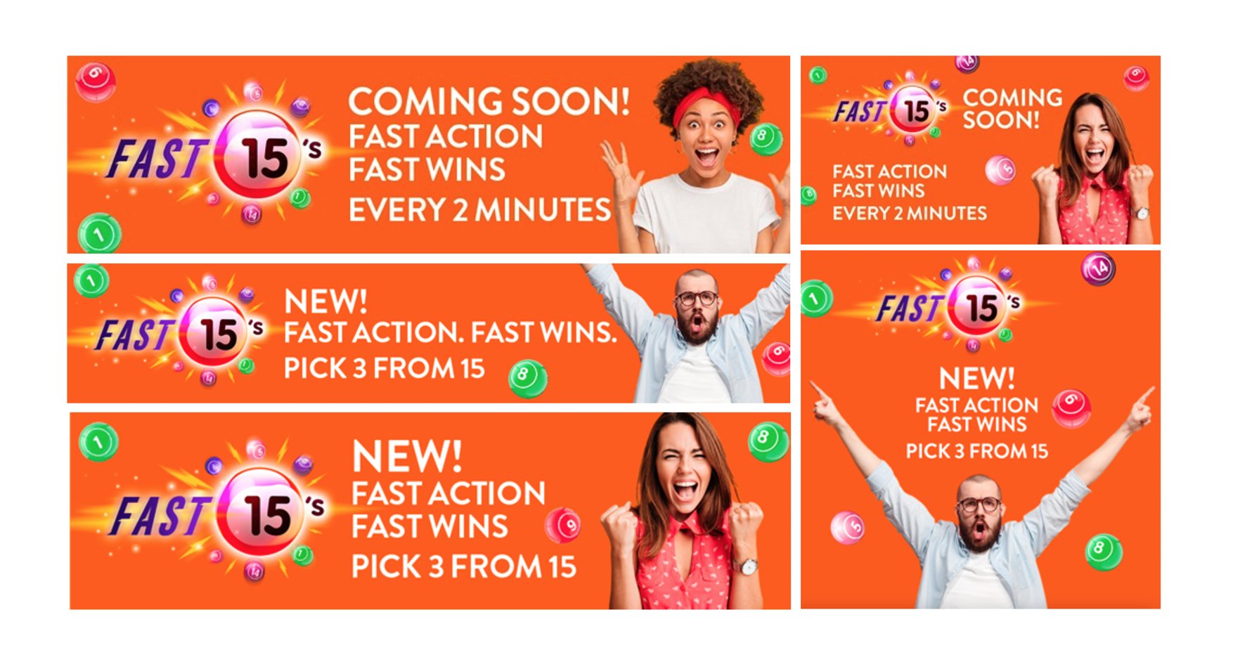
Games toolkits

Take a look at our other brand development stories.